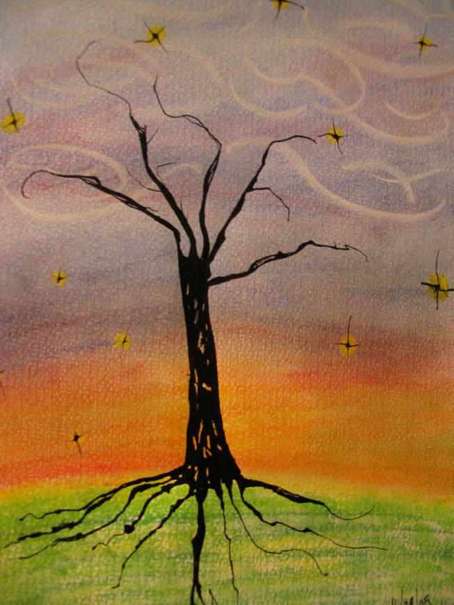
ROOTS for illustration friday. i actually don't like the roots in this drawing. i prefer the stars and the branches. i did it yesterday, but i've looked at it so many times since then that i don't like it that much anymore.
(was made with pastels, dipping pen and ink) (i used those chalky stick pastels but i don't know the exact name)

10 comments:
LOVE the stars, love the swirly cloud thingys, and I like the roots just fine. The black is a nice contrast against the soft colors!
I think your colors are wonderful - I like the way you pulled this off - nicely done!
This illustration drew me right in...immediately. It's a wonderful piece and you did an outstanding job with the color choices.
This is wonderful ..I love the simplicity of the illustration.
I think it's beautiful! Your pastel work and colors are great.
Oh no...you should like it very much! It struck me right away as a very evocative illustration. The inky blackness of the tree and roots against the pastel sky, and the swirls and stars all come together to create a sense of wonderment. It's like the last bit of light before night falls. It's lovely.
thank you all !!! thanks very much. i didn't expect i would get all these comments. :D especially since i'm constantly changing my nickname in the illustration friday submissions! ;)
What I think is that the sky is terrific. I have to remember that partial "success" is still success. I can't think of a time I have EVER had a piece that I liked completely. I hope you stick with a name so I can follow up!
I'm a bit late on posting a comment, but I agree pretty much with everyone, this is a strong piece. I really like the sky, the gradations are very well done.
Post a Comment